Last week, Microsoft opened up Windows Live, their answer to “social media”. Right off the bat, you can see why it’s a massive fail. Once you remember your Hotmail account from the mid-90s, use your Xbox or Zune login, you can see how the UI is very user-unfriendly. Importing feeds from other services is the only thing that’s quick and easy. However, if you want to add friends, you’re stuck with contacting them via Hotmail accounts that have long been deactivated or given over to spam. You can also add people via LinkedIn or Facebook, but that’s only provided those resources work. When I tested them last week, neither of them would invite contacts. This is fine with me as I don’t want my contacts from either site on this one.
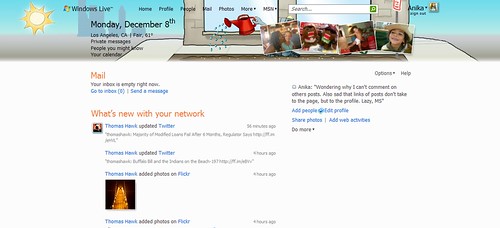
This is your Home page. From here you can see what your friends are doing. What you can not do is actually interact with your friends on this page. So say I wanted to comment on Thomas’ photo, I can either click the Flickr link, hunt for the photo and make a comment or I can go to Thomas’s page, make a comment there and hopes he sees it.
When you or your contacts has a post that feeds to Windows Live, the links to that service (i.e., Twitter, Flickr, StumbleUpon, etc) takes you to your friend’s profile page. You do not get taken to the link of that particular item. This is ridiculously frustrating in particular for those services I just listed.
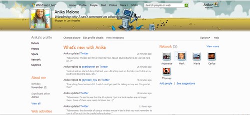
Here is my Profile page. This is the page where you tend to do everything from and here you can actually see my contacts, services being feed and a little about me. Toward the bottom of the page (not shown) is a text box for you to leave notes. This is something akin to Facebook’s “Wall” but without the functionality of letting you know there’s something down there. You must scroll to the bottom to see if someone left a note. Be aware that if you only use your Home page, you’ll never know there’s a note on your Profile page for you.
Which brings us back to actually setting up these pages. I began on my Profile page. I set up my services and then imported some photos to see if the photo uploader was as lame as the Facebook one (it is). Note that if you have more than one Twitter account, you’ll have to choose which one to feed. After you enter an option for a service, that particular service disappears from your list. Then I chose my template (the tiny Options link in the upper right) and noted how my text is practically unreadable with my cute little template. There are no options for changing your font or it’s color and size. Speaking of the template, the one I chose changes throughout the day. Unlike changing template pages in iGoogle, these change independently of one another. The images above were captured less than 5 seconds apart, but clearly one is in a more advanced stage of the other.
After a few hours messing about on my Profile page, I noticed the ‘Home’ link the top of the page and went to that. Suprises abound as I realized that the photos I imported on my Profile page do not show up on the Home page. So, I had to that all over again. The Home page layout is a static 2-column layout. You can not remove options, just juggle between the columns. So I’m stuck with the links and content for MSN, Headlines, Windows Live team blog and Tips & Tricks, whether I want them or not.
With all of these issues, I’m hard-pressed to reason out why I wouldn’t stick with FriendFeed or Facebook. I have a much larger network on both with actual functionality, despite Facebook’s obvious drawbacks. One thing that’s even more unclear is why my Xbox 360 profile doesn’t automatically import, or at least is a module I can add. Once again, Microsoft jumped into a situation and rolled out a product that gives us nothing but another useless link.


The Windows Live is doing it wrong by Anika Malone, unless otherwise expressly stated, is licensed under a Creative Commons Attribution-Noncommercial-No Derivative Works 3.0 United States License.
Tags: facebook, FriendFeed, microsoft, MSN, social media, StumbleUpon, twitter, Windows Live, xbox 360

