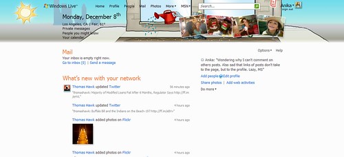
Windows Live is doing it wrong
Last week, Microsoft opened up Windows Live, their answer to “social media”. Right off the bat, you can see why it’s a massive fail. Once you remember your Hotmail account from the mid-90s, use your Xbox or Zune login, you can see how the UI is very user-unfriendly. Importing feeds from other services is the only thing that’s quick and easy. However, if you want to add friends, you’re stuck with contacting them via Hotmail accounts that have long been deactivated or given over to spam. You can also add people via LinkedIn or Facebook, but that’s only provided those resources work. When I tested them last week, neither of them would invite contacts. This is fine with me as I don’t want my contacts from either site on this one.
This is your Home page. From here you can see what your friends are doing. What you can not do is actually interact with your friends on this page. So say I wanted to comment on Thomas’ photo, I can either click the Flickr link, hunt for the photo and make a comment or I can go to Thomas’s page, make a comment there and hopes he sees it.


 Thanks for visiting my blog. I appreciate any comments, but disruptive ones, stupid ones, spammy ones and ones that just make no sense will be deleted. I don't mind if you post a comment related to your blog, but don't expect to be able to spam my blog with links to your blog. I will delete those comments and block users.